ProjectDesign Engineering · 2026
This Site
An editorial portfolio built in Next.js, with an odometer loader, gated ambience, route curtains, and a content system that turns MDX into a case study.
- Next.js 16
- React 19
- Tailwind CSS v4
- GSAP
- Lenis
- MDX
- Vercel
Design Engineering · Project
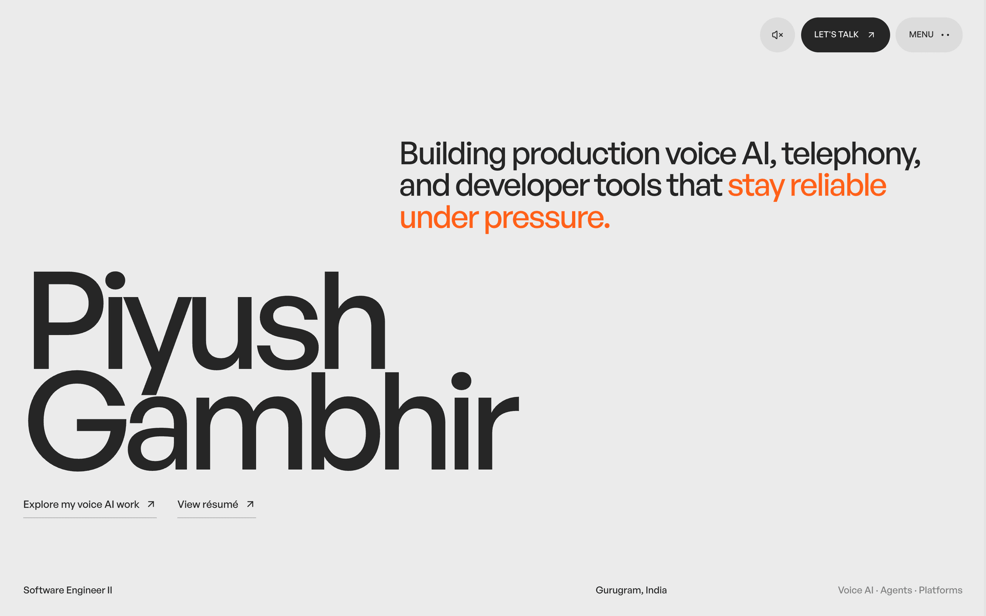
I build this site the way I build a product, and it is the only entry here whose subject is its own interface. It renders MDX into an editorial portfolio. An odometer loader waits for a click, a curtain covers every route swap, and a card flies into the hero of the page it opens. None of it comes from a theme.
The interesting part is not the animation. It is the rules the animation has to obey. A browser will not play audio before a gesture. A flight reads as one move only when its landing rect matches the destination. A reveal that hides text is broken the moment JavaScript fails. Every effect here has its fallback written first.
# The release gate in docs/DESIGN.md, in order pnpm typecheck pnpm lintcomponents/mdx/config.tsx 30:5 warning @next/next/no-img-elementlib/analytics/amplitude.ts 66:5 warning unused eslint-disable directive2 problems (0 errors, 2 warnings)Why not a template
docs/DESIGN.md states the thesis before any component exists. The site should feel like a calm, tactile instrument: oversized editorial type, long pauses, warm paper, one signal colour. The constraint that follows is the useful one. The interface has to be expressive without depending on project artwork, because most of what I build is a system rather than a screen. So the header carries no logo, only a strapline and a three-line menu, and a small orange dot marks the current route.
The way in
The loader is three odometer wheels and a bar. One GSAP tween drives a single number from zero to 100 over two seconds on power2.out. Every wheel reads its position off that number, so no roll is ever interrupted. The count is written straight onto the DOM rather than through React state, because a render per frame restarted the CSS transition underneath it. After a 520 millisecond hold the panel offers a way in, then waits. It waits because no browser grants audible playback before the origin has user activation. That click is the only thing that can start the ambience with the site.
Two kinds of motion
Site sections get a vertical curtain. A case study sweeps in laterally, on the axis its story is read, and leaving one reverses the move. Stepping between the writing index and an article skips the curtain entirely, because reading is a quiet move. From the next-project panel at the foot of a case study a click does something else. The panel’s palette block flies to the hero. Top, left, width and height are animated directly rather than through a transform, so object-cover re-crops every frame. It lands on the rect .project-hero__media already owns: left 48vw, 52vw wide, 100svh tall. Below 1024 pixels that panel does not exist, so the flight falls back to the curtain.
One face, one accent
There is one typeface, General Sans Medium, loaded locally under Fontshare’s license and used at weight 500 everywhere. Hierarchy comes from scale, line-height, opacity and spacing rather than from many weights. The canvas is #ebebeb paper, text is near-black ink, and #ff611a is the only saturated color on the page. Rows in a list are separated by space, never by rules. Case studies break the single accent on purpose. Each one draws from five palettes, chosen by a character-sum hash of its title. The card, the hero, the curtain and the share card all read the same one. A project keeps its color wherever it appears.
From MDX to page
A project is a folder holding project.mdx and, optionally, transcript.txt. Frontmatter names a chapter from the six editorial groups in lib/utils/projects.ts, which the filter row on the index counts. It also names two to four capabilities from a closed vocabulary, which become the tags. The transcript is one entry per line. $ marks a command, # a comment, > Name: a line of dialogue, and anything else is output. It renders as selectable text in the site’s own colours rather than as a screenshot. The hero panel takes a drawing first, then a capture, then that session, then the project’s initials. Each project also gets a 1200 by 630 share card from /og/project/[slug] in its own palette. llms.txt and feed.xml export the same set for machines. pnpm seo:check crawls a served build and compares canonicals, titles and share images against what the pages claim.
Costs and limits
- The gate buys sound and charges for it. A first visitor cannot reach the homepage without clicking. That is the decision I would revisit.
- Animating four geometry properties keeps the flight honest. The cost is that the hero split has to stay at 48vw and 52vw, so a component and a stylesheet have to agree.
- There is no dark mode, by decision. One palette is what gives the paper and the accent their meaning, and a second would need a second set of project palettes.
prefers-reduced-motion removes the loader, the curtains and the flight, and every reveal resolves to visible, so nothing depends on an animation finishing. The release gate is pnpm typecheck, pnpm lint and pnpm build, then a look at 390 pixels and desktop width. An automated browser pane confirms none of the motion, because a hidden document never fires the frames it runs on. That part is checked by eye.
Next projectWeb Development